<!DOCTYPE html>
<html lang="en">
<head>
<meta charset="UTF-8">
<meta name="viewport" content="width=device-width, initial-scale=1.0">
<title>Mother of Pearl Effect</title>
<style>
body {
background-color: #ffffff; /* 黑色背景 */
margin: 0;
height: 100vh;
display: flex;
align-items: center;
justify-content: center;
}
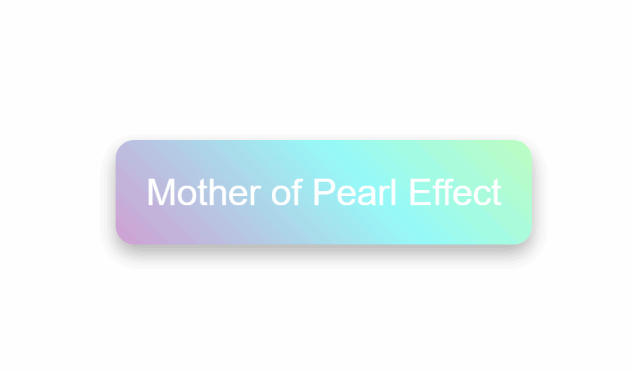
.mother-of-pearl {
background: linear-gradient(45deg, rgba(255, 235, 255, 0.3), rgba(255, 255, 225, 0.3)),
linear-gradient(45deg, rgba(255, 0, 150, 1), rgba(0, 255, 255, 0.9), rgba(255, 255, 0, 0.9), rgba(255, 0, 150, 0.9));
background-size: 100%, 300% 300%;
animation: pearlescent 3s infinite ease-in-out;
border-radius: 12px; /* 更圆润的圆角效果 */
box-shadow: 0 6px 12px rgba(0, 0, 0, 0.3); /* 更强的阴影效果 */
color: #fff; /* 文字颜色 */
padding: 20px; /* 内边距 */
text-align: center; /* 文字居中 */
font-size: 24px; /* 字体大小 */
font-family: Arial, sans-serif; /* 字体 */
position: relative;
overflow: hidden; /* 确保内容不溢出 */
}
@keyframes pearlescent {
0% {
background-position: 0% 0%;
}
25% {
background-position: 90% 90%;
}
45% {
background-position: 190% 0%;
}
65% {
background-position: 0% 190%;
}
85% {
background-position: 0% 70%;
}
100% {
background-position: 0% 0%;
}
}
</style>
</head>
<body>
<div class="mother-of-pearl">
Mother of Pearl Effect
</div>
</body>
</html>